
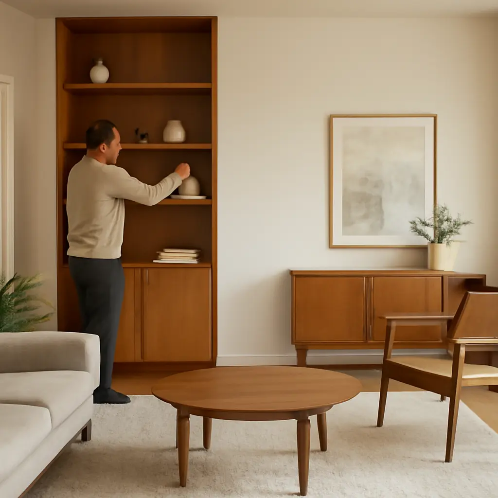
A collected room feels intentional because its furnishings, colors, and personal objects relate to one another; it does not need to be sparse or perfectly matched. The practical trick is to edit for visual hierarchy: give the eye a few clear anchors, repeat selected colors or materials, and group smaller objects instead of scattering them. This approach draws on interior-design principles such as balance and repetition, while making room for the individuality that gives a home character.
Visual hierarchy makes a room feel collected, not cluttered
Visual hierarchy is the arrangement of elements so some attract attention first and others support them. In a room, the anchors might be a substantial rug, a distinctive sofa, an artwork, or a bookcase. The American Society of Interior Designers describes interior design as shaping spaces around people’s needs and experiences; in practice, that means a room should be both legible and useful, not simply decorated.
There is no universal number of objects that makes a room feel cluttered. The effect depends on scale, contrast, spacing, and how many elements compete for attention. A useful starting point is to choose one or two focal points per area, then let supporting pieces reinforce them. For example, a large painting can lead the living-room arrangement while a patterned cushion and a ceramic vase echo its colors without competing with it.
Choose anchors before adding accents
An anchor is a visually prominent or functionally important element that gives the surrounding arrangement a point of reference. Identify the room’s strongest existing feature—a fireplace, window, architectural detail, or favorite piece of furniture—and arrange other items in relation to it. If nothing naturally takes the lead, a large rug or substantial artwork can establish a focal zone.
Scale matters: a small artwork floating above a large sofa can feel disconnected, while several tiny accessories on a broad table may read as visual noise. Before buying anything, test the placement with painter’s tape or paper cut to the intended size. This simple step helps reveal whether the proposed piece has enough presence for its location.
Use negative space as part of the composition
Negative space is the visible area left unoccupied around furniture and objects. It gives individual pieces room to register and helps circulation remain comfortable. Empty space is not wasted space: a clear stretch of wall or an uncluttered section of tabletop can make a meaningful object more noticeable.
Try removing a few items from a crowded surface, then look at the arrangement from the doorway and from the room’s main seating position. Keep what has a purpose, a personal story, or a strong relationship to the overall palette. Store, relocate, or donate the rest rather than trying to make every object visible at once.
Color and material repetition connect collected objects
Repetition is the reuse of a color, shape, texture, or material across a space. It creates continuity among objects that may differ in age or style. A room can mix vintage furniture, contemporary lighting, and handmade ceramics yet feel coherent if a few visual cues recur—for instance, warm wood, dark metal, and a muted green.
A restrained palette does not require every item to match. Instead, choose a small group of related colors and allow variation in their shades and proportions. Benjamin Moore’s color guidance commonly emphasizes testing samples in the actual space, since daylight, artificial lighting, and surrounding finishes influence how paint appears. Treat paint chips, fabric swatches, and material samples as practical tools, not just shopping references.
Repeat a few colors across the room
Color repetition can be subtle: a hue in an artwork may reappear in a cushion, a book spine, or a small object on a shelf. Repeating a color in several locations helps the eye travel around the room. Keep one color dominant, use one or two supporting colors, and let neutrals provide breathing room.
For a real-world example, imagine a living room with a blue-and-rust landscape painting. Blue could recur in a cushion and a book cover, while rust appears in a ceramic bowl and a patterned rug. The objects remain distinct, but their shared colors make the assortment feel deliberate.
Mix materials while keeping a common thread
Material variety adds depth: wood, glass, metal, linen, wool, and ceramics each reflect light and feel different to the touch. The room becomes visually busy when every piece introduces a new finish with no repetition. Choose a few recurring materials, then use contrasting textures as accents.
A practical combination might pair a wooden coffee table with a wool rug, linen curtains, and a metal lamp, then repeat the wood or metal elsewhere. The aim is not to enforce a strict matching set; it is to establish enough shared language that contrasting pieces still belong together.
Grouped objects feel intentional rather than scattered
Grouping is the practice of arranging related objects as a composed unit. A tray can bring together a candle, a small bowl, and a book; a shelf can display a few ceramics as a cluster. Grouping makes collections easier to read than distributing similar objects across every available surface.
The National Association of Productivity and Organizing Professionals recommends establishing practical systems for belongings and spaces. Applied to decorating, that principle means giving collections a defined home and making everyday storage easy to maintain. A display can be attractive, but it should also be simple to dust, use, and reset.
Arrange accessories in varied heights and shapes
A composed group usually benefits from variation: combine one taller object with lower pieces, and balance rounded forms with books or angular items. Leave visible gaps so the group does not become a solid mass. A tray or shallow bowl can define the boundary of a tabletop grouping, while a small stack of books adds height.
Use odd-numbered groupings as a flexible design prompt, not a rigid rule. Three objects of different heights may feel more relaxed than three identical items, but the best arrangement depends on the objects and the surface. Step back, photograph the arrangement, and remove anything that competes with the group’s strongest piece.
Edit shelves and collections in layers
A layered shelf combines books, objects, and intentional empty areas. Rather than filling every shelf edge to edge, alternate denser sections with open space. Place some books upright and others in short horizontal stacks, then add a few meaningful objects that vary in scale.
For collections, rotate what is on display. A collector does not need to show every piece at once: keeping a portion safely stored and changing the display occasionally protects visual clarity while allowing the collection to remain part of the home. This is particularly useful for small rooms, where storage and display space are limited.
Personal meaning gives a room its collected character
A collected room reflects the people who live in it through chosen objects, art, books, and furnishings accumulated over time. The difference between collected and cluttered is not whether an object is old, expensive, or coordinated. It is whether the object has a place and contributes to the room’s use, story, or visual balance.
The U.S. Environmental Protection Agency reports that Americans generated 292.4 million tons of municipal solid waste in 2018, with furniture and furnishings among the materials tracked in its waste data. That national figure is not a measure of household clutter, but it is a reminder that thoughtful editing, repair, reuse, and secondhand purchasing can be practical alternatives to buying more décor.
Display objects with a story, not every object you own
Meaningful display starts with selection. A travel memento, inherited bowl, or family photograph can add character, especially when it is given enough space to be noticed. Pair personal objects with simpler furnishings or neutral surfaces so their stories remain legible rather than being lost in a crowd.
A useful test is to ask whether an item is loved, used, or genuinely helpful to the room. If it meets none of those criteria, it may be better stored, passed on, or displayed elsewhere. This is not a call to make a home impersonal; it is a way to make the personal objects more visible.
Balance display with everyday function
A room’s arrangement should support daily life. Keep frequently used items within reach, provide a landing spot for keys or remotes, and avoid blocking pathways with decorative furniture. The Centers for Disease Control and Prevention advises reducing fall risks at home by addressing hazards such as clutter on floors and walkways. Clear circulation is therefore both an aesthetic choice and a practical safety measure.
Use closed storage for items that are useful but visually distracting, such as cables, paperwork, toys, or spare accessories. Baskets and lidded boxes can help, provided they fit the space and are easy to put back. The best storage system is one that matches household routines rather than requiring constant effort.
Conclusion: edit, repeat, and give meaningful pieces room
Making a room feel collected rather than cluttered starts with visual hierarchy: establish anchors, preserve negative space, and let supporting elements play a quieter role. Repeat a handful of colors and materials to connect varied furnishings, group accessories so they read as compositions, and display personal objects selectively. Finally, protect clear pathways and provide practical storage so the room works as well as it looks.
Start with one surface or shelf today: remove everything, return only the pieces you use or love, and leave a little space around them. Then assess the room from its entrance and make one small adjustment. That measured editing—not another round of shopping—is often the simplest route to a home that feels personal, calm, and complete.
Sources: American Society of Interior Designers, About Interior Design, https://www.asid.org/about; Benjamin Moore, How to Choose Paint Colors, https://www.benjaminmoore.com/en-us/color-overview/how-to-choose-paint-colors; National Association of Productivity and Organizing Professionals, About NAPO, https://www.napo.net/page/AboutNAPO; U.S. Environmental Protection Agency, National Overview: Facts and Figures on Materials, Wastes and Recycling, https://www.epa.gov/facts-and-figures-about-materials-waste-and-recycling/national-overview-facts-and-figures-materials; Centers for Disease Control and Prevention, Check for Safety: A Home Fall Prevention Checklist for Older Adults, https://www.cdc.gov/steadi/pdf/check_for_safety_brochure-a.pdf.


